CQU Brand Refresh
Transformation
An inspiring and accessible visual identity for Australia’s largest regional university
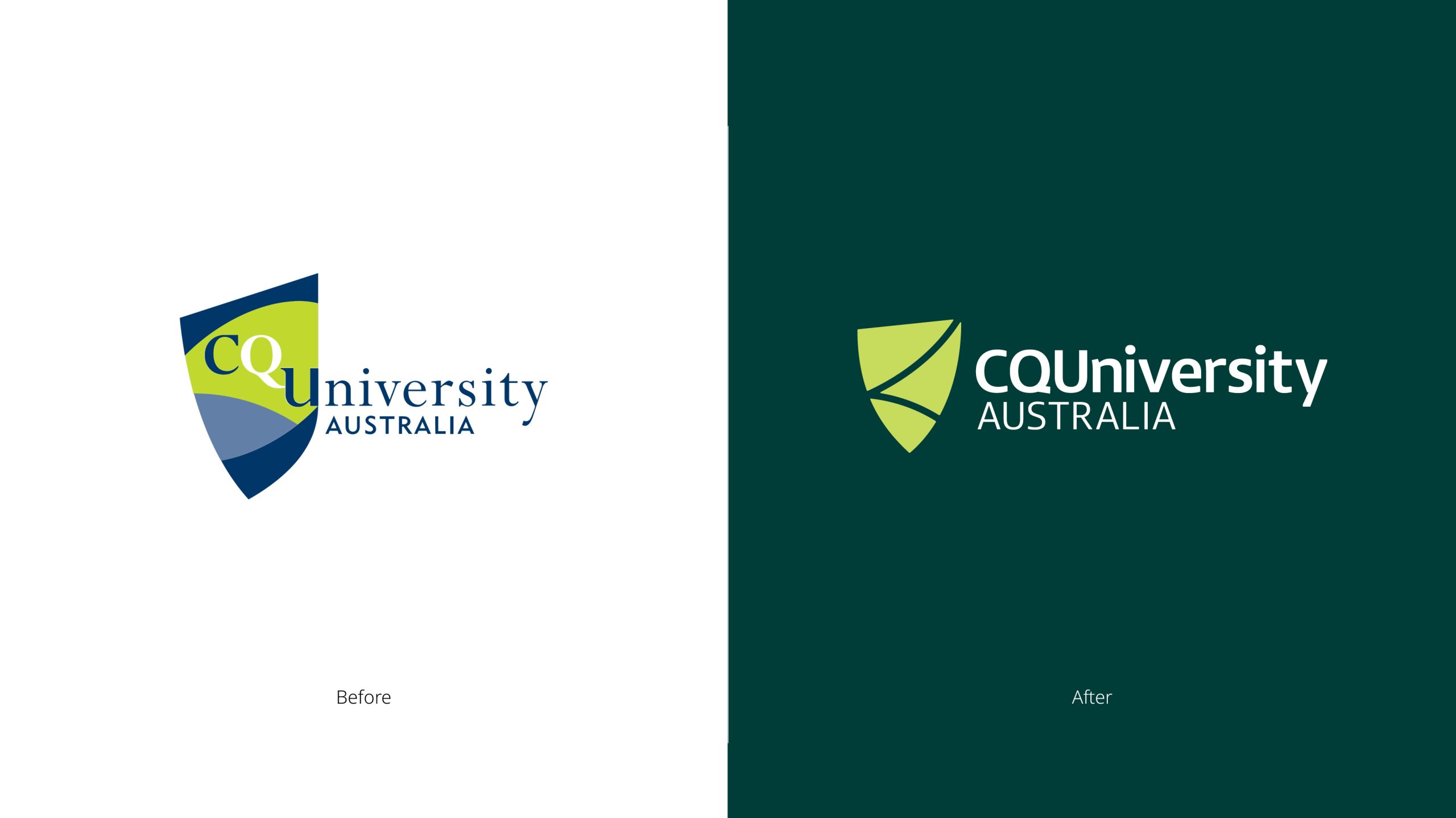
CQU (Central Queensland University) and Brother & Co had been discussing the need for a visual brand refresh. In 2024 the time came to make it a reality.
As ever, balancing modernity and heritage was vital. As too was the creation of a brand identity system that had greater accessibility and digital flexibility whilst elevating the brand image to reflect the quality of education experience and outcomes CQUniversity delivers.
The project involved a comprehensive process of research, collaboration and creative refinement.
Process:
1. Initial Briefing & Research
In addition to establishing brand tracking, Brother conducted a thorough audit of the existing designs and application requirements. This led to several vision-setting workshops, where the team presented inspiration, shared desk research and collaborated closely with CQU to define the design ambition. A detailed competitor and peer review helped identify opportunities for greater brand distinction.
2. Core Goals Definition
From these workshops, three core goals emerged:
- Refresh the brand’s visual identity for greater impact.
- Refocus the brand’s messaging to better align with key attributes.
- Revise brand codes and system to ensure coherence and modern appeal.
3. Brand Identity Development
The refreshed identity aimed to:
- Be distinct, welcoming, and elevated with a confident tone.
- Enhance brand differentiation, moving beyond mere distinction.
- Align with CQU’s diverse cohorts, capturing the wide range of ambitions and outcomes the university offers.
- Offer high levels of accessibility.
4. Brand Positioning
The brand positioning was updated to reflect CQU’s new strategic direction, with the expression of “Be What You Want to Be” adapted to resonate with different audiences—such as school leavers and mature adults. The positioning also aimed to highlight the university’s flexibility, offering various pathways and opportunities.
5. Creative Development
Brother developed several identity options, focusing on key brand elements. These options were socialised with CQU stakeholders, discussed, and refined based on feedback.
6. Collaboration & Implementation
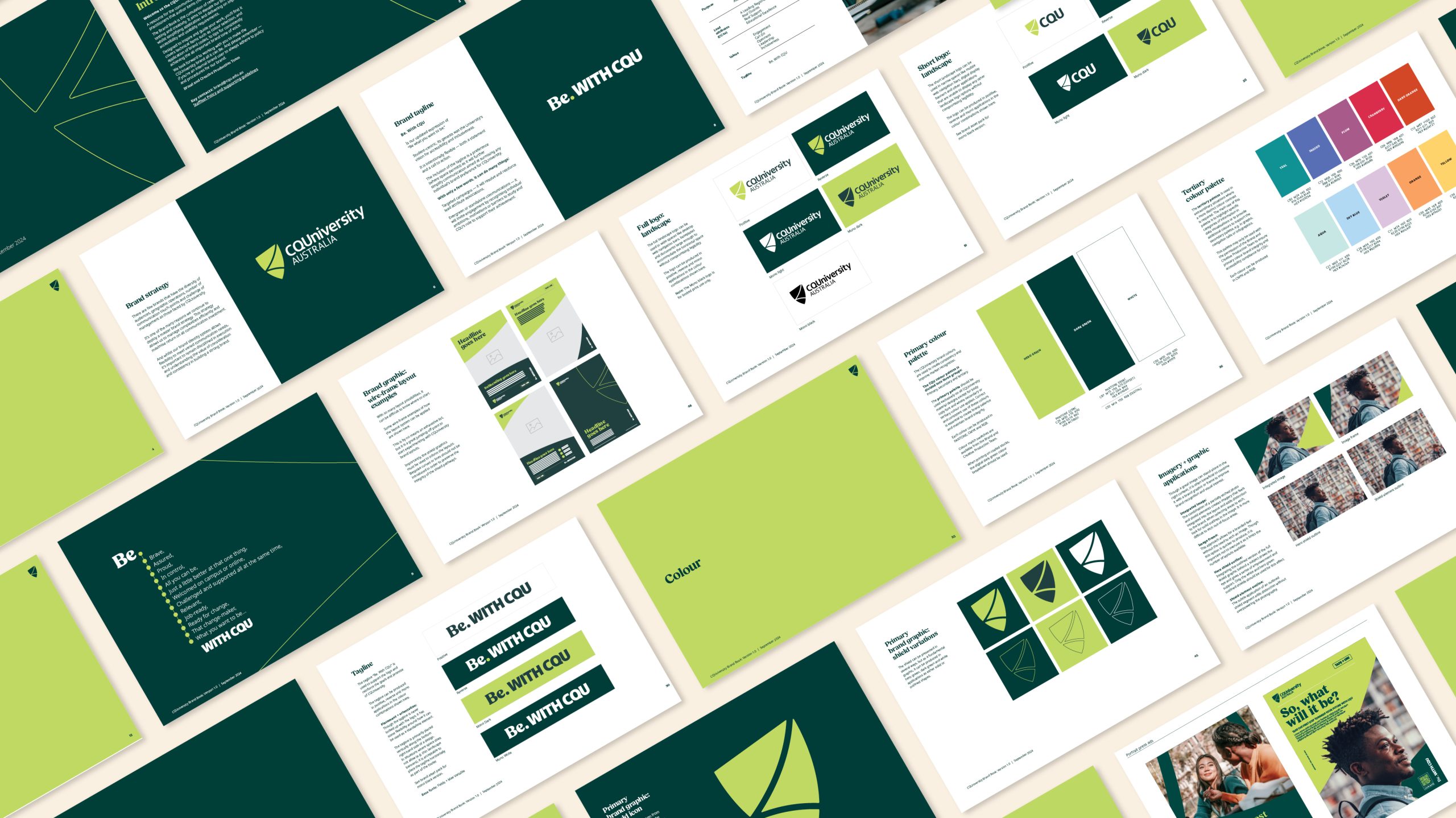
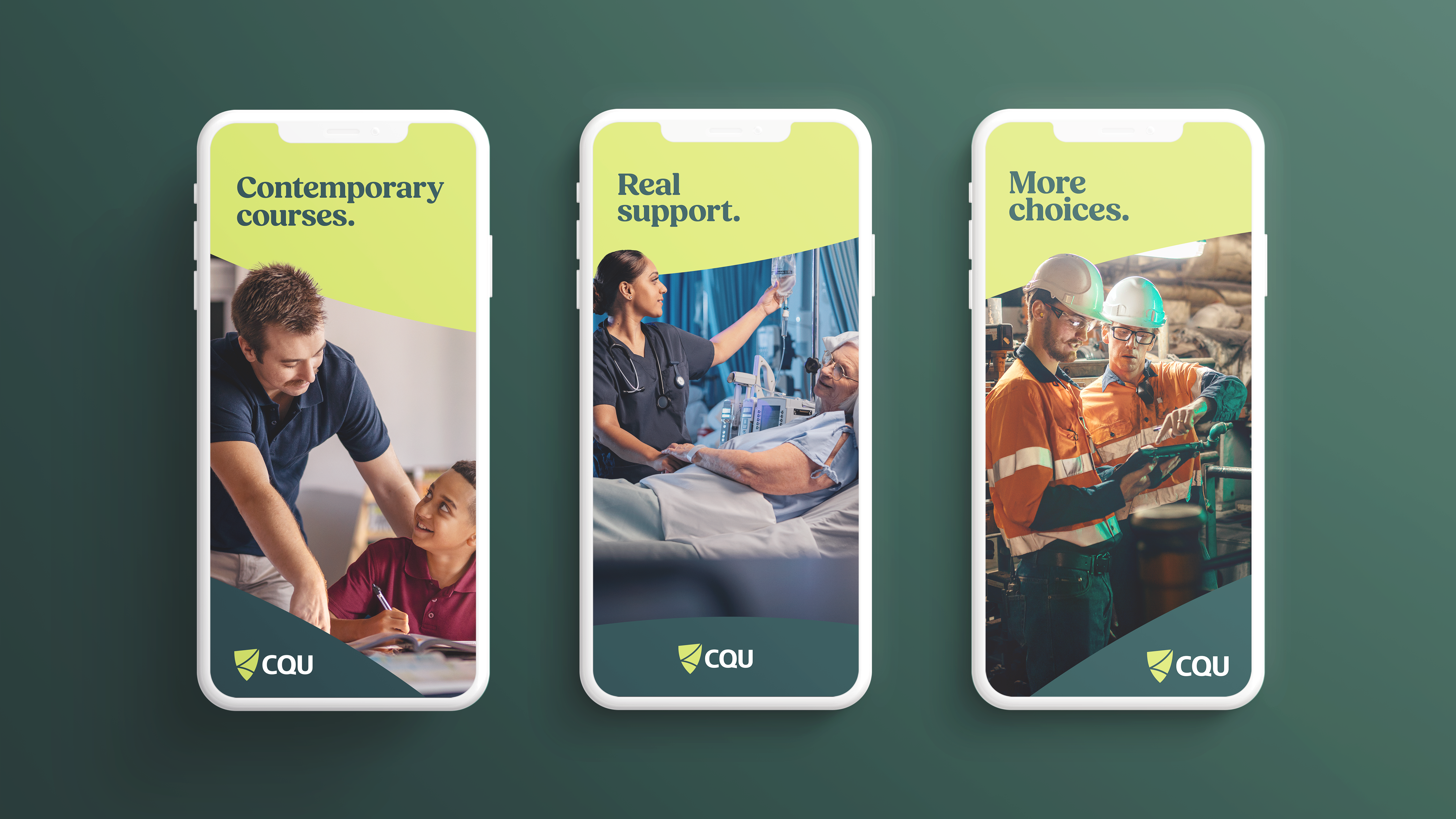
The project required close collaboration between Brother’s design leadership and CQU’s internal teams to ensure the final identity not only met creative ambitions but was also implementable across hundreds of applications including: publications, content, events and digital advertising channels.
7. Stakeholder Engagement
Throughout the project, key stakeholders were consulted at critical stages to ensure alignment and buy-in, ensuring the final design would resonate with internal and external audiences.
The attached video captures key elements and greater detail behind the various brand codes, design elements and applications.
Outcome:
The refreshed visual identity has elevated CQU’s brand, making it more distinct and confident while maintaining its welcoming, inclusive ethos.
The visual identity and positioning refresh project ran concurrently with the development of a new creative platform that would inspire and guide future messaging and communication.
Featured on Design Rush Best Designs page.
Deliverables
- Brand strategy and positioning
- Competitor review
- Identity vision setting
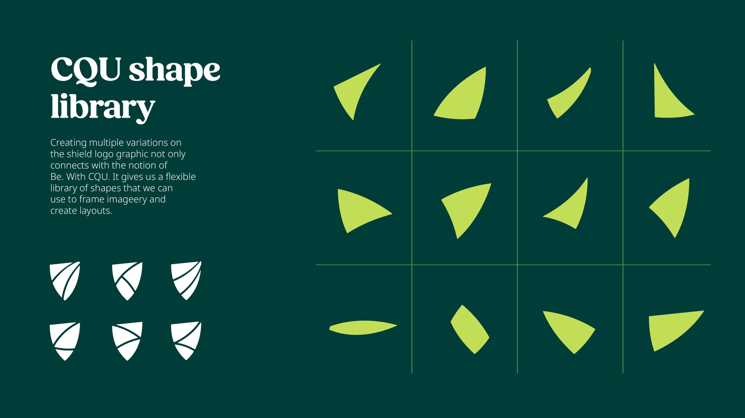
- Identity development (logo, brand codes, types, imagery and photography)
- Style guide – comprehensive
